The Bright House, Museum Quarter, Amsterdam Old South
The Concertgebouw neighbourhood is situated right at the heart of the elite Museum Quarter. One of the most wanted areas to stay, when you desire to live the Uptown Amsterdam lifestyle. Here you will find the larger 19th and early 20th century apartments and townhouses, situated ideally between Vondel park, Museum square and Concert building. It is a lively neighbourhood filled with good restaurants, nice bars, and high-end shops.
Here our clients wanted to renovate their three-floor apartment into something that will suit their real needs. They are enthusiastic hosts and love to entertain their guests, friends, and family in a proper way. Music, tasty food, excellent wine, and fine company are part of their weekly routine. In smaller or larger settings, depending on the occasion.
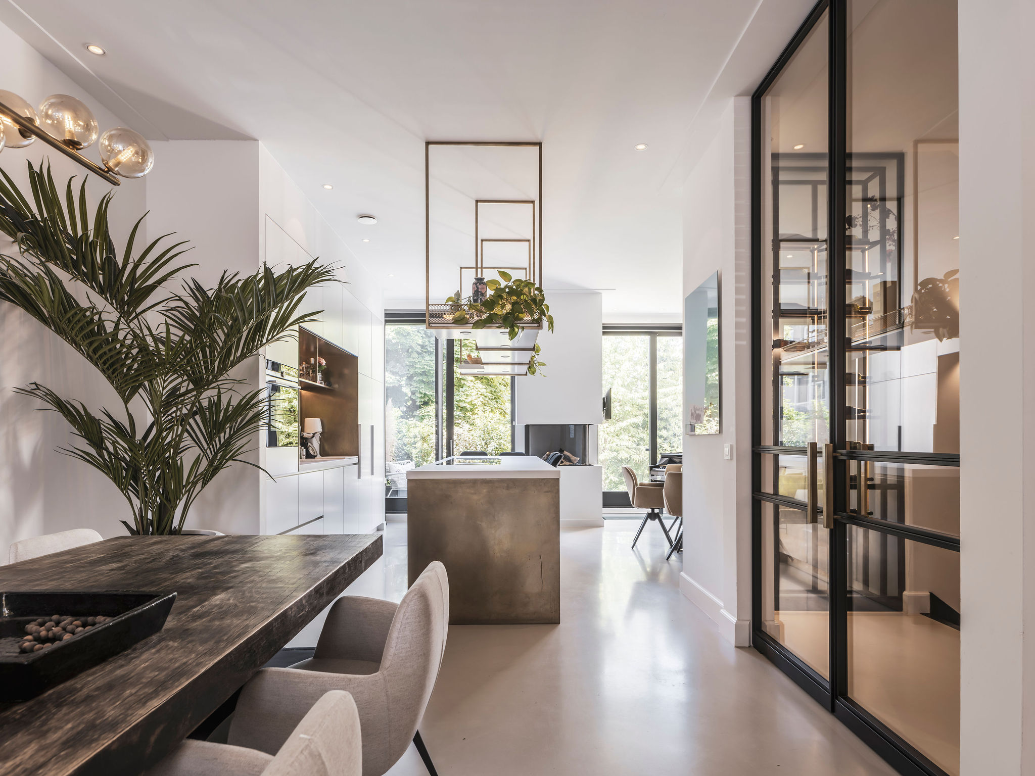

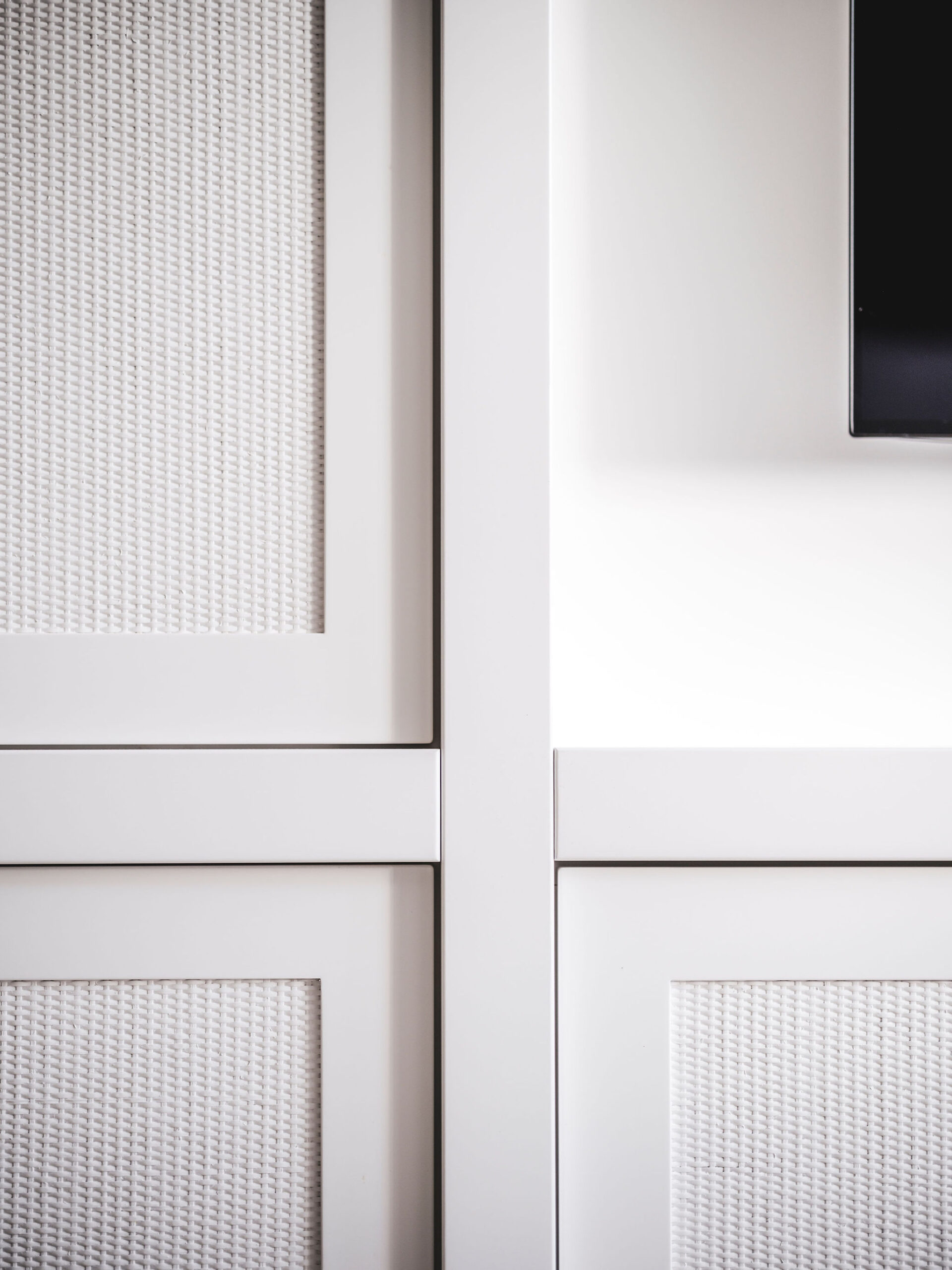
As often in these situations, the demolition of the entire space is required, so a new layout, wiring, lighting, and plumbing plan can be executed. We extend the building with a maximum of four meters, newly built into the garden. Now we can position an open entertainment kitchen, with induction cooking and wok burner. The extraction comes from the sink, so we lose the extraction hood. It allows you to keep maximum contact with the guests. We deliberately placed the cooking area in front, so it becomes part of the entertainment.
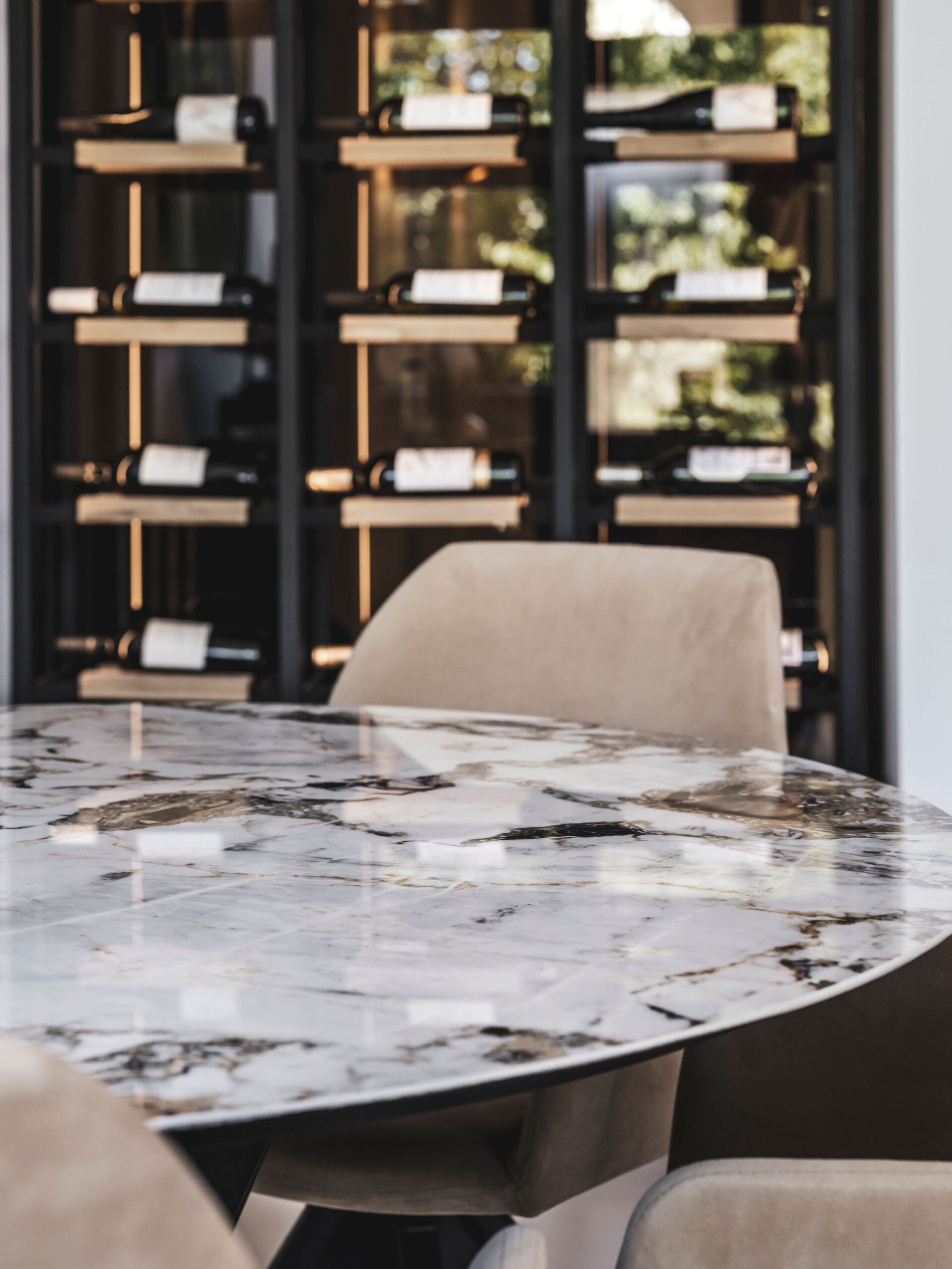
Several seating areas are placed around the kitchen. From a massive twelve seat table made of tropical solid wood, to a slender round marble five-seater. . In the far front we located a low seating area where you can informally ‘hang’ and eventually watch a movie.

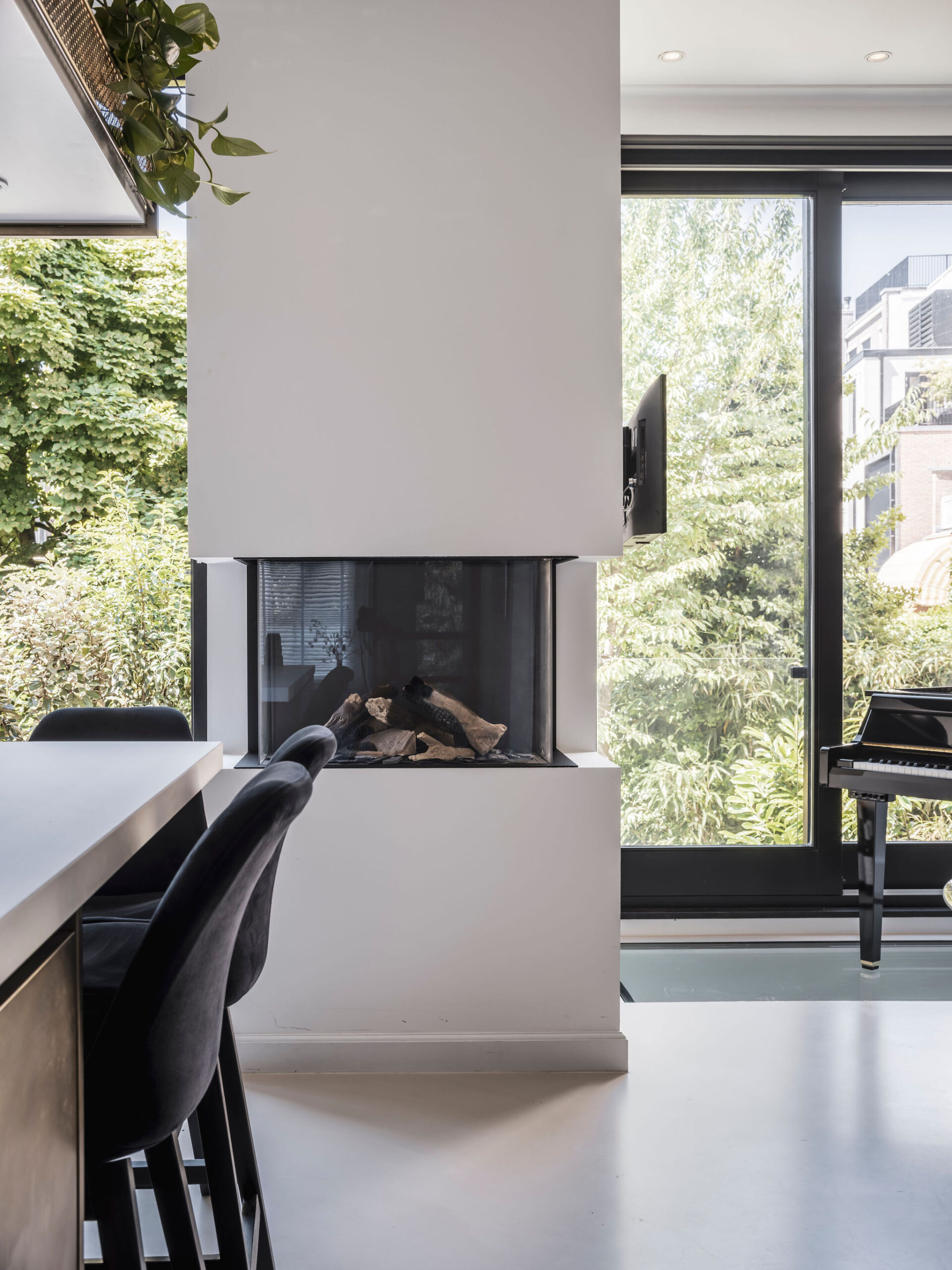
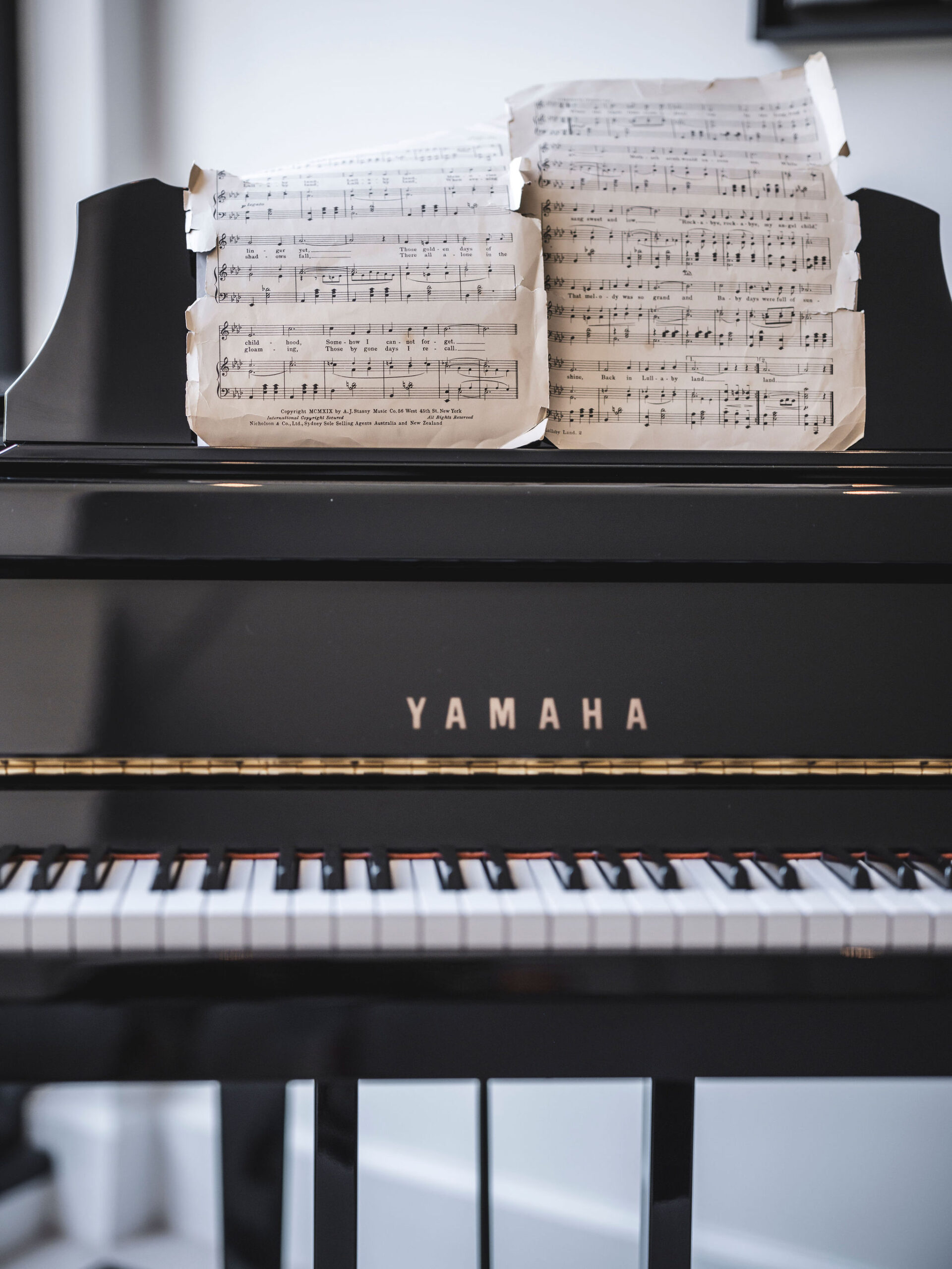
The new backside is completed with floor to ceiling windows, to enjoy the ‘park like’ landscape of the inner court yards, with full grown trees. Unique for this part of Amsterdam. In the centre we created a fireplace. ‘Imagine the contrast between fire and snow in wintertime’. The piano looks out over the treetops. Because of the length and depth of the layout we wanted to get as much light in the house as possible, to avoid dark areas in the heart of the building.
We choose to paint everything bright white, so it will not feel dark. A typical Dutch tradition. Because of that you will also be fully aware of the subtle changing of light and shadows, from the bright morning light to the warm afternoon glow. Also, a lot of mirroring surfaces are used, to catch the maximum reflection.

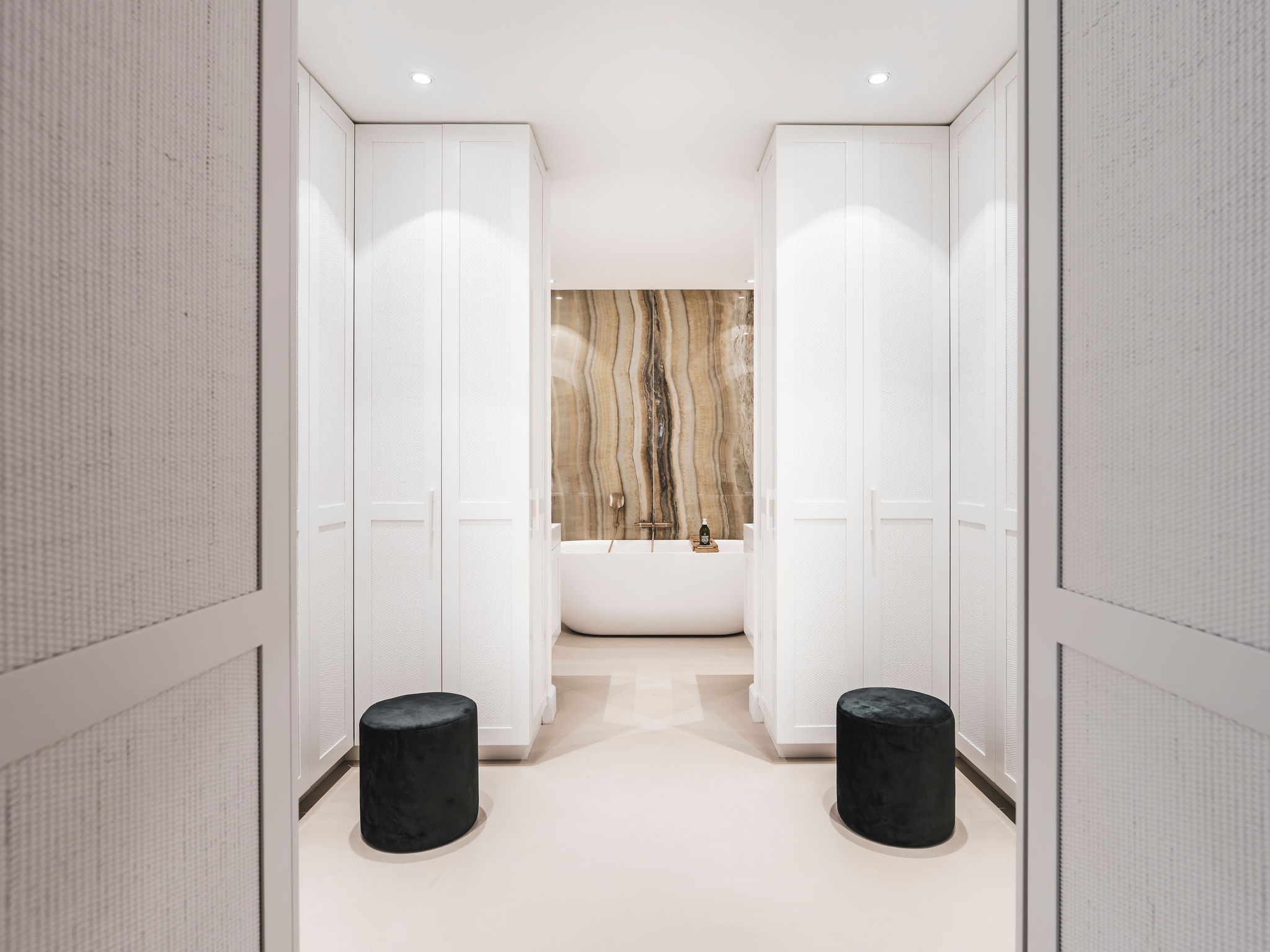
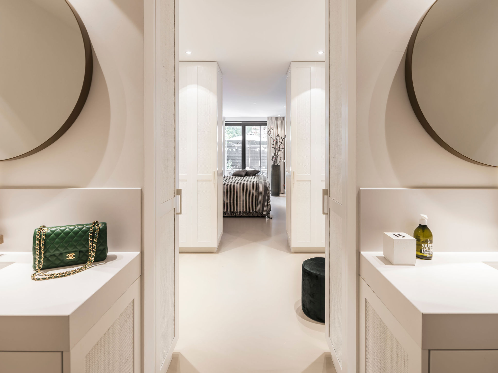
The Master suite contains the trinity between sleeping, bathing, and dressing, in one continuous transparent lay out. The design from the bathtub to garden is built around a catwalk, with a completely free line of sight. It divides the dressing and bathing area in a practical ‘Hers’ and ‘Hims’.
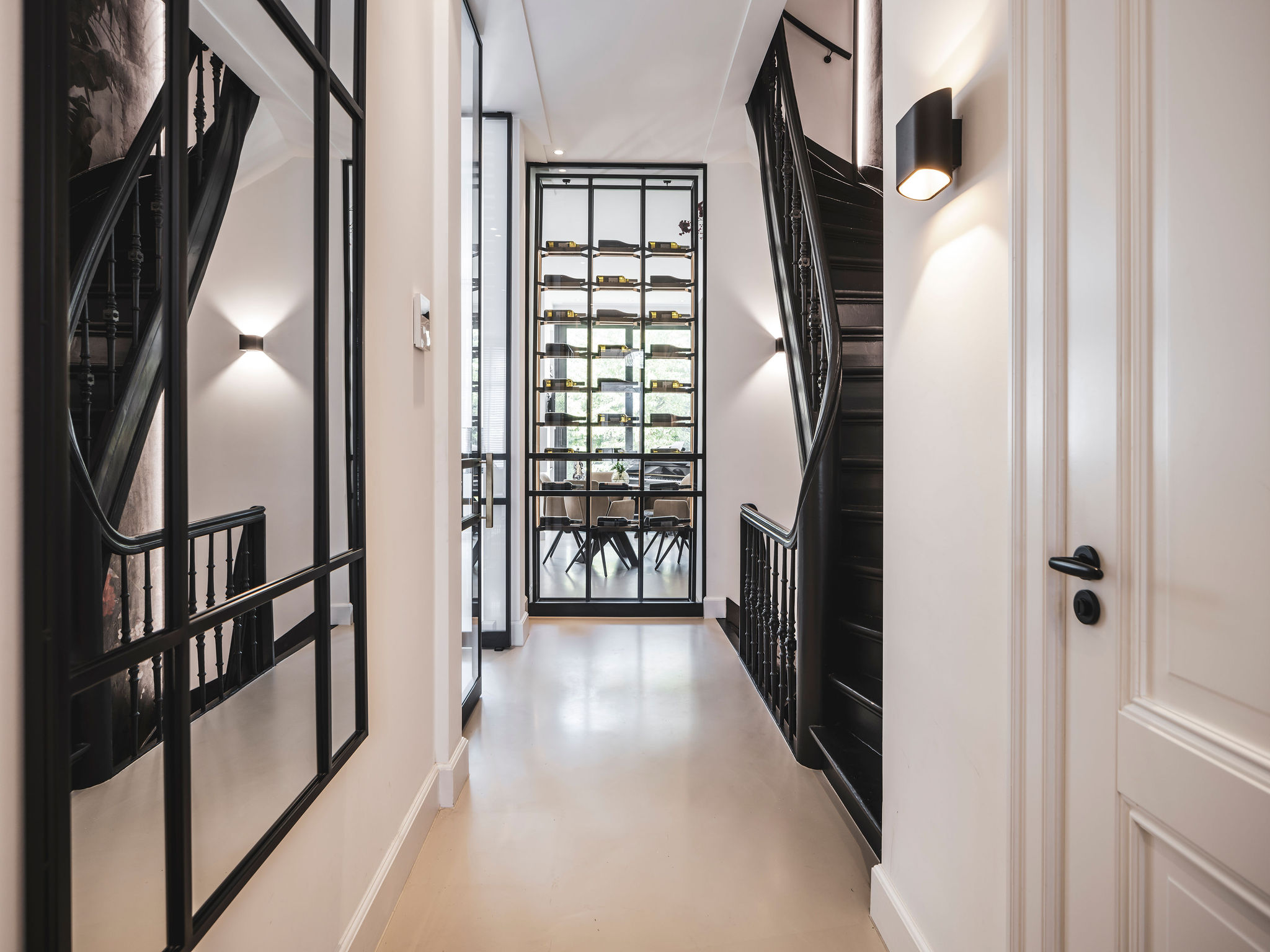
The colour palette is quite simple and functional in understanding the design. A bright white shell for the ‘static’ architectonical parts and a material orientated colouring scheme for the ‘action’ parts such as kitchen, divers seating, bathing and bed. The staircase stands out as a leading and binding object, which connect the various levels together.
